
Introduction to ggplot2
Graphics in R
The R language has extensive graphical capabilities.
Graphics in R may be created by many different methods including base graphics and more advanced plotting packages such as lattice and ggplot2.
The R Graph Gallery
You’ll find a rich selection of graphs and example code to generated them in R at The R Graph Gallery
ggplot2
The ggplot2 package was created by Hadley Wickham and provides an intuitive plotting system to rapidly generate publication quality graphics.
ggplot2 builds on the “Grammar of Graphics”
Resources
Paper on the grammar of graphics as the foundation for ggplot2
Online working draft of 3rd Edition of ggplot2: Elegant Graphics for Data Analysis
ggplot2 cheatsheet
ggplot2 in practice. Plotting mtcars
To demonstrate the use of ggplot2 to plot data according to the grammar of graphics, let’s recreate the mtcars plot I just showed you.
Let’s work in our attic/development.R script for now.
Initialising a plot
The first thing we need to do is initialise a new plot.
Function ggplot() is used to construct the initial plot object, and is almost always followed by + to add components to the plot.
Let’s load the library and create an empty plot:

Specifying the data
Next thing we need to do is specify the data.
The first argument to ggplot() is the data we want to use for plotting, usually a data.frame or tibble. We can pipe that in to ggplot().
mtcars |>
  ggplot()
Mapping to Aesthetics with aes()
Now that we’ve specified our data, we can start encoding our variables to visual properties of our plot.
Lets start by mapping mpg and hp to our two axes. We do that in the second argument mapping through function aes().
Function aes() is used to specify the set of aesthetic mappings between variables in the data and visual properties in our plot.
Any aesthetics defined in ggplot(aes()) will apply to all subsequent layers unless they are overridden within the individual layers.
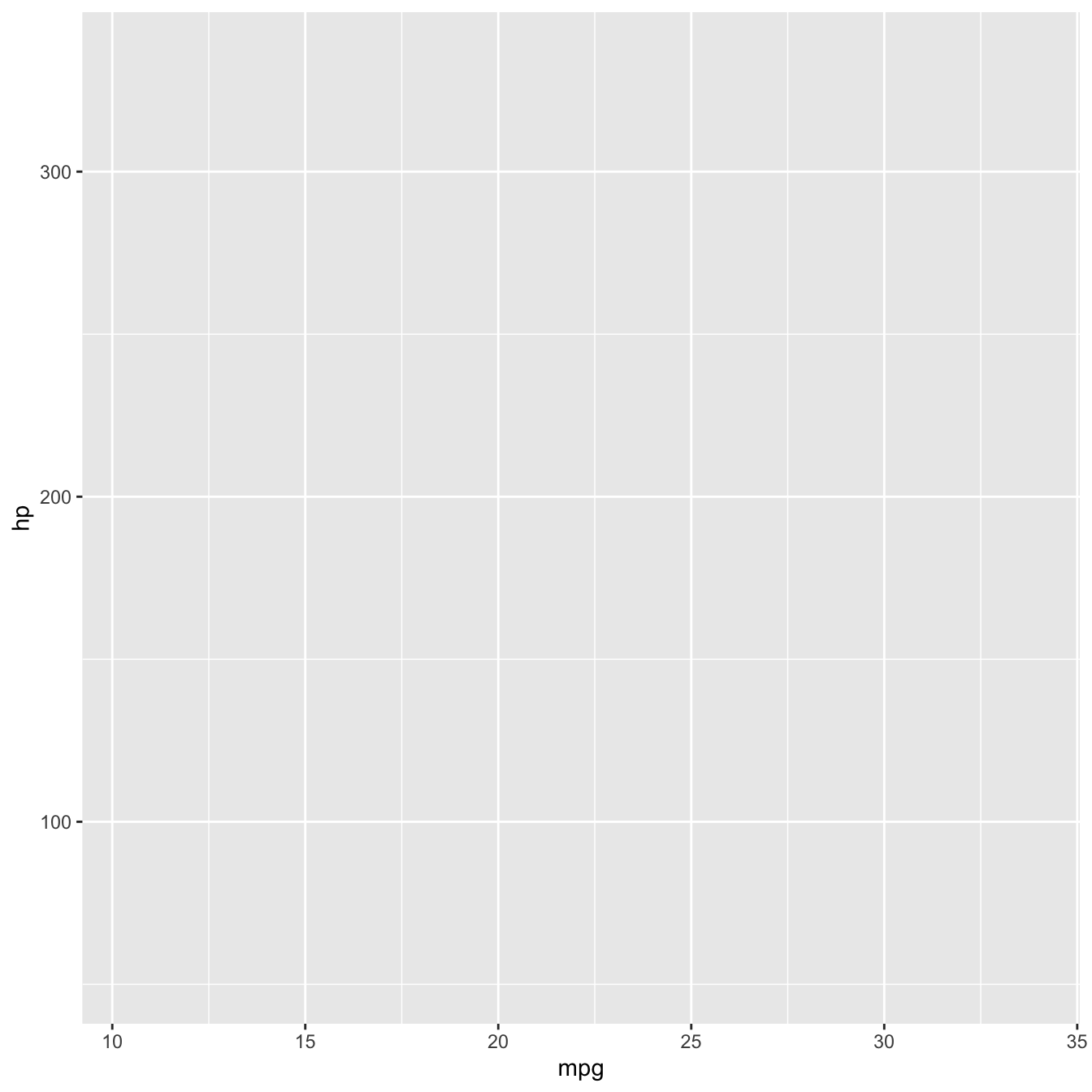
Mapping variables to axes x and y.
In our case, we want to map variable mpg to aesthetic x (the x axis) and variable hp to aesthetic y (the y axis).
Adding geometries with geom_*()
Currently, we only have our axes, initialised with reasonably inferred scales from the data.
Following the specification of data and aesthetics, we next need to specify which geometries (or geomss in ggplot) to use to present the data. The geom is a critical component that describes the type of plot.
Several geoms are available in ggplot2 as separate functions:
-
geom_point()- Scatter plots -
geom_line()- Line plots -
geom_smooth()- Fitted line plots -
geom_bar()- Bar plots -
geom_boxplot()- Boxplots -
geom_jitter()- Jitter to plots -
geom_histogram()- Histogram plots -
geom_density()- Density plots -
geom_text()- Text to plots -
geom_errorbar()- Errorbars to plots -
geom_violin()- Violin plots
Plotting a scatterplot
To visualise the relationship between the data points in our two variables, and given both are numeric, we can plot them as points on a scatterplot using geom_point().
mtcars |>
  ggplot(aes(x = mpg, y = hp)) +
  geom_point()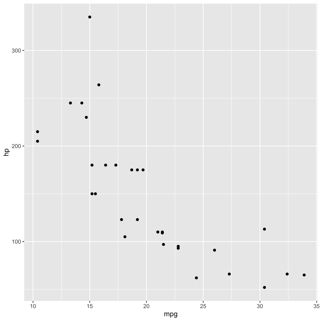
Mapping a third variable
Now that we exhausted our first two options for visual encoding, we can use other aesthetics in our plot to map additional variables to. Example aesthetics available for geom_point() are
-
colororcolour: maps the outline colour of the geometry to a variable. -
shape: maps the symbol used to plot points to a variable. -
fill: maps the fill colour of geometries that have afillattribute to a variable. -
size: maps the size of points to a variable.
colour vs fill for points
The default geom_point() shape (shape 19) is a solid filled circle that only responds to the colour aesthetic, not to fill. So if you map fill = some_variable without changing the shape, the mapping is silently ignored and your points stay one colour.
If you want to use both colour and fill on points (for example, an outline colour distinct from the fill), set the shape to a value between 21 and 25 — these are the shapes that have separate outline and fill attributes:
ggplot(data, aes(x = ..., y = ..., colour = ..., fill = ...)) +
geom_point(shape = 21)pch values)
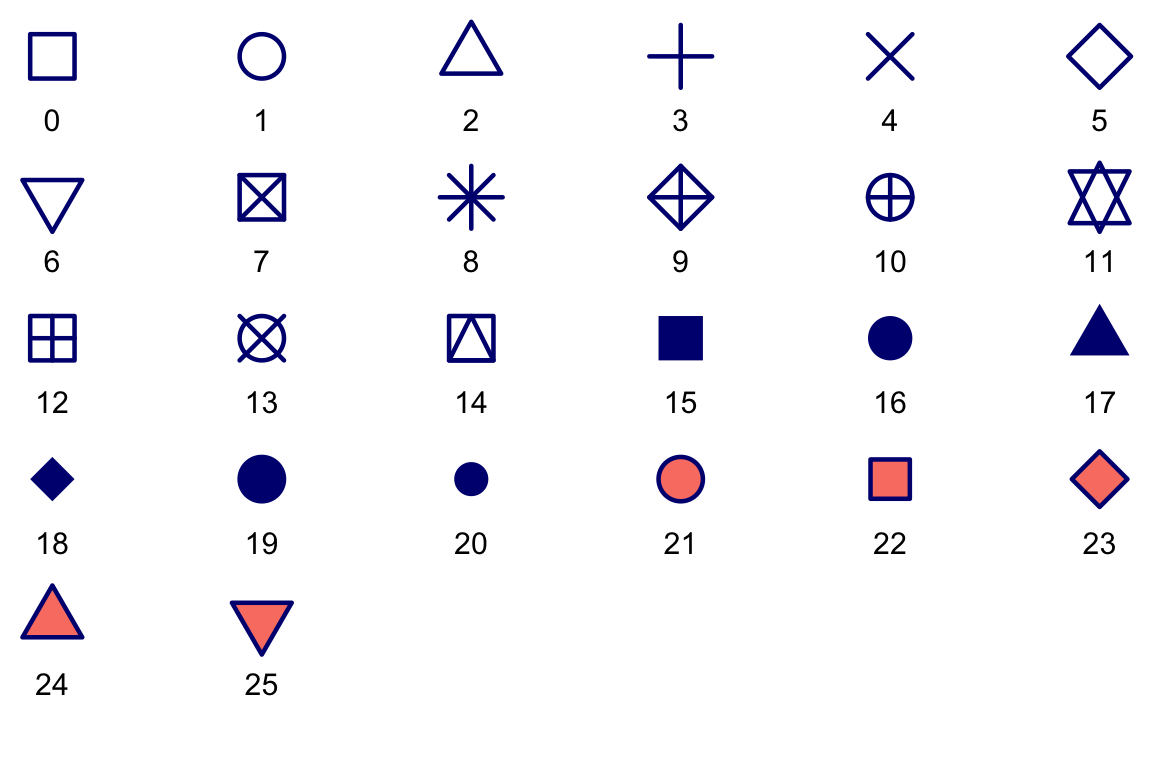
Here’s the classic R reference plot showing all 26 point shapes available, numbered 0–25. Each point is drawn here with a navy outline (colour) and a salmon fill (fill) so you can see at a glance which aesthetics each shape responds to:
- Shapes
0–14are outline-only — they usecolourand ignorefill. - Shapes
15–20are solid —colourcontrols the whole shape,fillis ignored. - Shapes
21–25have separate outline and fill —colourcontrols the outline,fillcontrols the fill.
Let’s now map the colour of points to the number of cylinders cyl.
mtcars |>
  ggplot(aes(x = mpg, y = hp, colour = cyl)) +
  geom_point()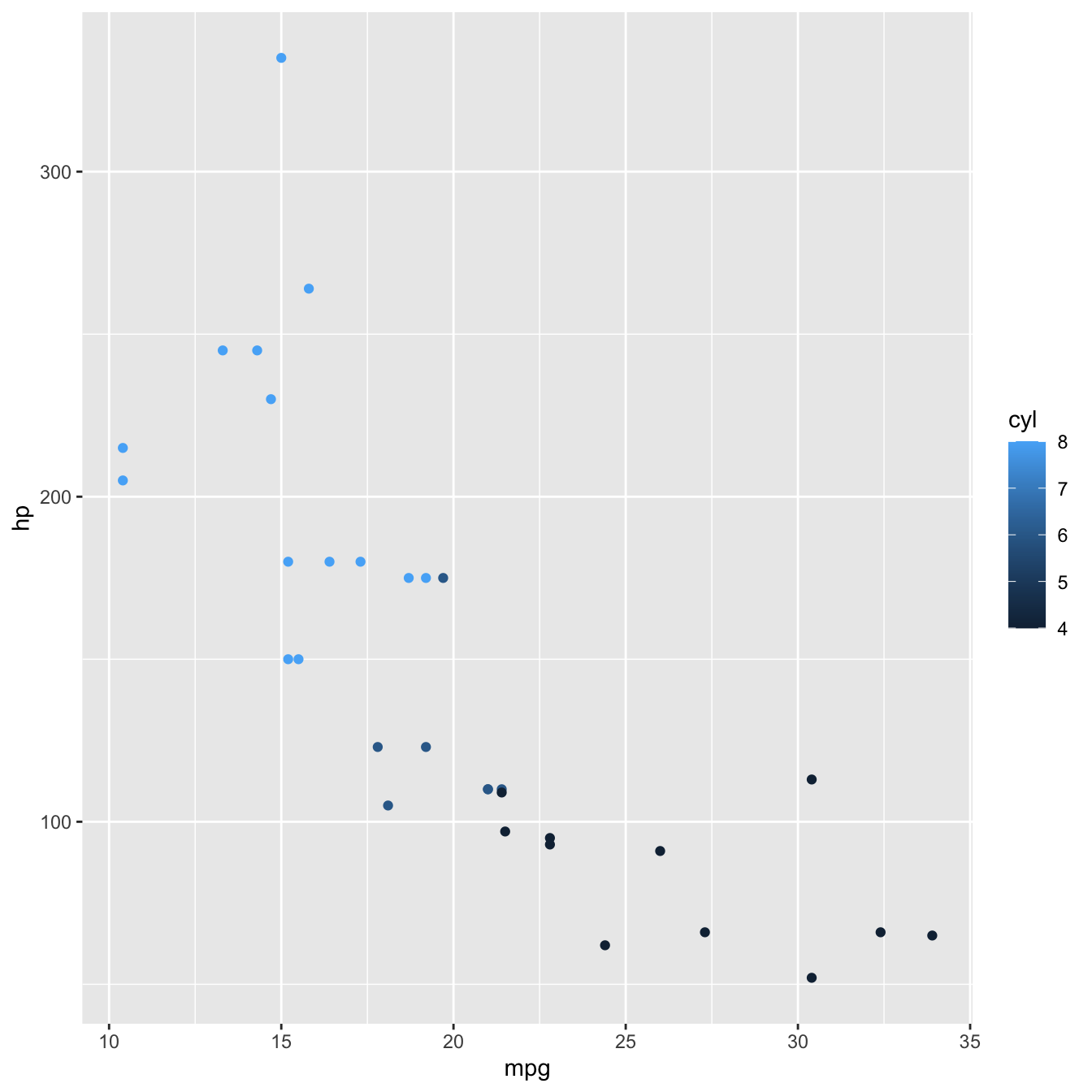
Now each point is coloured according to the value of cyl.
Because cyl is numeric, the default behaviour of R is to present it on a continuous numeric scale, hence the colour gradient legend.
If we want to present cyl as a categorical variable, we can override that behaviour by turning it into a factor using factor()
mtcars |>
  ggplot(aes(x = mpg, y = hp, colour = factor(cyl))) +
  geom_point()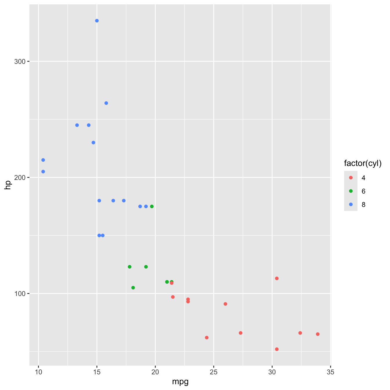
Adding a plot theme
Finally, any design elements can be specified in the theme layer. Theme elements can be customised using function theme()
ggplot2 also has a number of in built themes. Let’s just use one of those, theme_light().
mtcars |>
  ggplot(aes(x = mpg, y = hp, colour = factor(cyl))) +
  geom_point() +
  theme_light()